
The Shopify Subscription Pricing Table Decoy Option
If you sell anything a customer could buy again, a shopify subscription pricing table decoy option is probably the single highest leverage design decision on the page, and most brands build it backward.
Most subscribe and save pages lead with the subscription, price it lowest, and let the one time purchase sit beside it looking like the sensible, no obligation choice. Flip that. The one time option should still be on the page, but it should be built to lose, so the subscription or bundle option wins because the table makes it the obvious smart choice, not because the copy argued anyone into it.
The shopify subscription pricing table decoy option, explained
A decoy pricing table is three options, shown in this order, left to right or top to bottom:
- The best value tier, badged as such, usually the largest size or longest subscription term.
- The middle tier, badged most popular, priced to look reasonable next to the best value tier.
- The one time purchase, shown small, unbadged, with no visual weight.
The one time option is not there to convert. It is there to make the other two look obviously smarter by comparison. A shopper scanning three boxes with one clearly undersold does not do the math on whether the subscription is a good deal. They do the math on which of the three looks worst, and buy one of the other two.
Why the one time option has to lose on purpose
This only works if every tier shows unit economics, price per serving, per use, or per day, next to the total. A large number shrinks the moment it is divided. $89 a month reads as expensive. $2.97 a day reads as nothing. Put the per unit price beside every tier, including the one time option, and the comparison does the persuading without a single extra sentence of copy.
Pair that with a genuine struck through anchor price. The discount has to be the story, and the reference price has to be real, never an invented inflation. A fake anchor is the first thing a sceptical buyer catches, and once they catch one, they stop trusting the rest of the page.
The one time option is not there to convert. It is there to make the other two look obviously smarter by comparison.
What this actually moves, measured
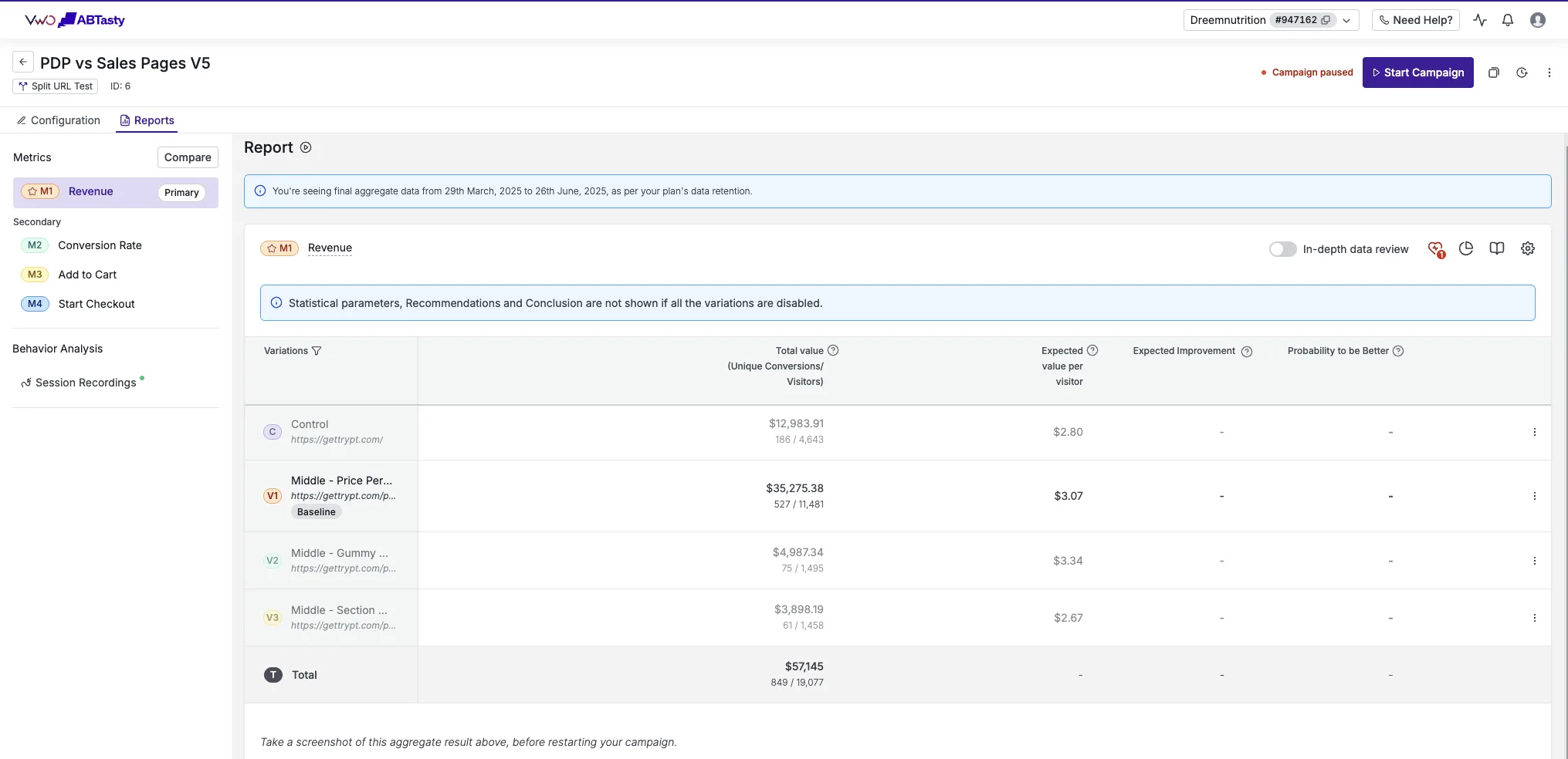
This is not a theory we are guessing at. Dreem Nutrition, a wellness gummy brand, ran an offer page against their own product page on VWO with full metric tracking and saw revenue per visitor rise 19%. The win came from the whole offer architecture, tiered pricing, the decoy, unit economics, stacked value, not from a single element test.
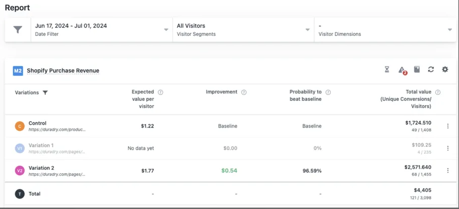
DuraDry, a sweat care brand built on repeat use, ran the same kind of test on Google Ads traffic over two weeks and saw revenue per visitor rise 45%. A consumable product is exactly the category where a decoy pricing table earns its keep, because the buyer is already thinking in refills and routines, not a single purchase.
Particle for Men, a men’s skincare brand, ran its offer page against its product page on VWO at 99.5% confidence across 12,893 visitors, and revenue per visitor rose 21.4%. That page is still live, unchanged, two years later. All three of these results read directly from the testing platform, split on each brand’s own traffic, never from ad platform reported revenue, which is the only honest way to know a pricing table actually worked.
We have run this kind of test, and the fuller offer architecture around it, across our full set of results, and we guarantee any page we rebuild lifts revenue per visitor by 10% or more in a controlled test, or the client gets their money back. The full terms are on the guarantee page.
What breaks a decoy pricing table
Three mistakes show up constantly, and any one of them is enough to flatten the table into a wash:
- Equal visual weight on all three tiers. If nothing looks worse, nothing looks obviously better.
- No unit economics. Without the per day or per serving number, the shopper is left doing arithmetic in their head, and most will not bother.
- A trust cluster that only appears once. Guarantee, shipping, cancel anytime, repeated under every buy button, not just the first one. A shopper who scrolls to the third tier and finds no reassurance assumes there is none.
None of this requires a redesign of the whole page. It requires getting the table itself right, in the order above, with real numbers behind every claim it makes.
See it on your own page.
We rebuild your highest-leverage page and prove the lift on your own live traffic. A 10% lift in conversion rate, or your money back.
Book a call