
Real vs Fake Anchor Pricing on Shopify: What Shoppers Catch
A shopper on your product page has seen a thousand fake sales before yours, and real vs fake anchor pricing on Shopify is something they can spot in about five seconds. The moment they catch a struck through price that was never real, they stop reading your offer and start looking for the exit. That split second decides more of your conversion rate than any button color ever will.
Real vs fake anchor pricing on Shopify, and why shoppers can tell
An anchor price is the number you cross out so the number next to it looks smaller. Done honestly, it is one of the most reliable levers in ecommerce: a genuine reference price, shown beside the real price, makes the real price feel earned rather than asked for. Done dishonestly, Shopify makes it almost too easy. Set a compare at price with no history behind it, and the theme draws the strike through for free.
The problem is that shoppers have gotten good at spotting the fake ones. A price that has always been half off is not an anchor, it is wallpaper, and enough shoppers now know the difference that an invented discount can cost you trust before it ever earns you a conversion. We have watched this play out across more than a dozen controlled tests on real Shopify and DTC traffic, and the pattern holds every time. The discount is not the lever. The believability of the discount is.
What makes an anchor price fake, to a skeptical shopper
Nobody reads your terms and conditions to catch a fake anchor. They catch it the same way you would, instinctively, from signals that are easy to list and hard to fake around:
- A round, suspiciously generous compare at price that sits far above anything a similar product sells for elsewhere.
- A discount that never changes. If the sale has been running since the site launched, it was never a sale.
- No explanation for why the price is lower now. A real anchor has a reason: a launch price, a bundle saving, a quantity break.
- A number that does not match the product’s own history. Shoppers who have bought from you before remember what they paid.
None of this requires sophistication to notice. It requires five seconds and a second tab.
What a genuine anchor looks like, and what it still has to do
Being honest is the floor, not the win. The anchor still has to carry the sentence it is part of, and the way we build it is to stack real value next to it rather than lean on the discount alone. If a bundle includes three items a shopper would otherwise buy separately, we total what those three items cost on their own and show that total crossed out next to the bundle price. That number is real because it is arithmetic, not invention, and arithmetic is a kind of proof a shopper trusts more than a banner.
The same logic applies to subscription pricing. A page offering a one time purchase next to a subscribe and save option should show the per unit price for both, because a large total number shrinks the moment it is divided into something small and dated. The one time price still gets shown, just shown small, so the subscription tier reads as the obvious smart choice without ever saying so.
The discount is the story. The reference price has to be real, not an invented inflation.
This is measurable, not a matter of taste
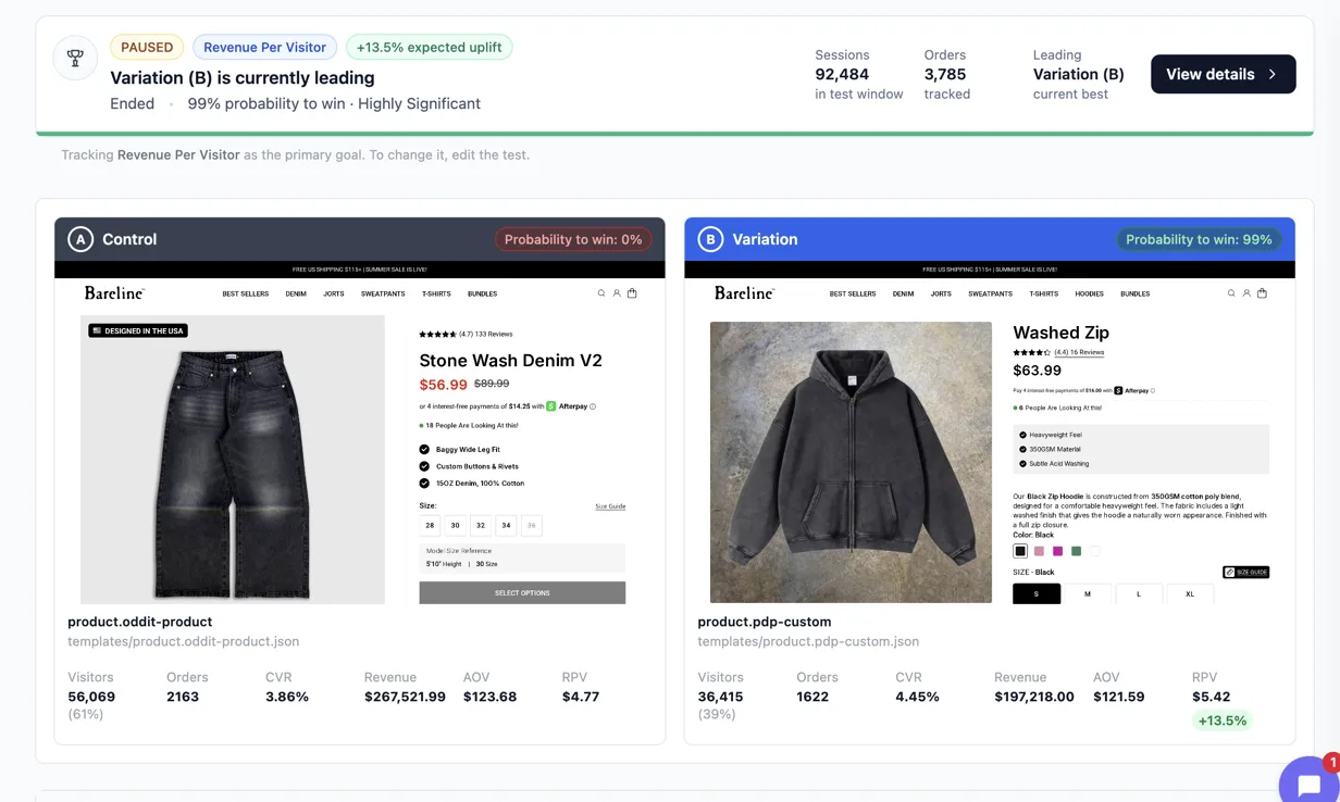
We rebuilt the offer page for Bareline, a streetwear denim brand, testing our product page template against their existing one on sitewide product traffic. The result was a 13.5% lift in revenue per visitor, at 99% probability to win across 92,484 sessions, read through Eraya. Nothing on that page relied on an invented discount. The pricing was built the way described above: real numbers, shown honestly, stacked to make the value obvious rather than asked for on faith.
PIP Wellness saw a larger jump on a different page type entirely: a listicle style offer page against their product page, on Meta traffic, read through ABConvert. Revenue per visitor moved from $0.40 to $0.66, a 64% lift. That page leaned harder on value stacking than on a steep discount, because the category makes an aggressive percentage off read as suspicious rather than generous.
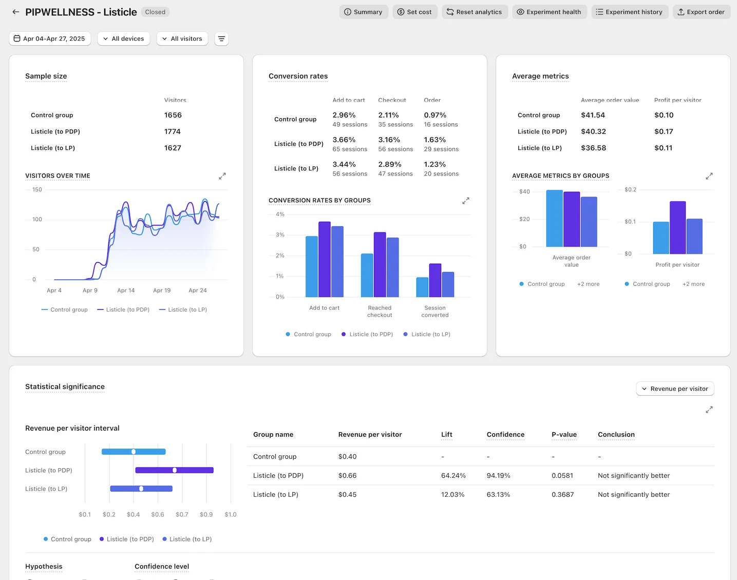
Both of these were read as revenue per visitor, never conversion rate alone, because that is the number that proves a lift was not just a cheaper looking page pulling in lower intent buyers. Conversion rate can go up while revenue per visitor goes down, and the only way to know which one happened to your page is to check both.
Build the anchor you can actually defend
If you cannot explain to a shopper, in one sentence, why the crossed out number is real, do not show it. Use what you actually have instead: a genuine bundle total, a real quantity price break, a launch price with a date attached to it. It is slower to build than typing a number into the compare at field, but it is the difference between a page that converts once and a page that keeps converting once shoppers start comparing notes with each other.
If you want to see what this looks like across more than a dozen rebuilt offer pages, the full set of results is public, methodology included. And if you want to know what happens when a rebuild does not clear a real lift in conversion rate, that is what the guarantee covers.
See it on your own page.
We rebuild your highest-leverage page and prove the lift on your own live traffic. A 10% lift in conversion rate, or your money back.
Book a call