
Product Page Trust Signals Order, Ranked
Most brands get their product page trust signals order backward, leading with a review count or a badge row while the one piece of proof that would actually change a visitor's mind sits three scrolls down, unseen by everyone who never scrolls that far.
Fifteen of our page rebuilds have run as controlled tests against a brand’s own live page, split on their real traffic, and read from the A/B testing platform rather than the ad account. The lifts range from 10% to 310% in revenue per visitor. None of them came from a badge. All of them came from putting the right proof in front of the visitor at the right moment, in the right order.
Product page trust signals order, ranked
Not every proof element carries the same weight, and treating them as interchangeable is the first mistake. Roughly strongest to weakest, based on what actually moves a skeptical stranger:
- A founder or a credible association. A real person the visitor can hold accountable answers the most basic doubt, whether this company actually exists and stands behind what it sells.
- An ambassador roster with real credentials. Not recognizable faces, credentialed ones.
- A scientific or medical advisory board, where the institution behind the name carries the weight, not the name alone.
- A real clinical trial with named outcomes and, ideally, a registry link a visitor could check.
- Third party testing and certifications.
- Volume and rating proof, units sold, a star average, a review count.
- Verified reviews and video testimonials.
The order is not arbitrary. A stranger doubts the brand before they doubt the product, so authority proof answers a deeper objection than a star rating does. Put the weak proof first and the strong proof never gets read.
Where each one belongs on the page
Placement follows the same logic as the ranking. The strongest proof the brand actually has goes above the fold, in the first scroll, before the visitor has decided whether to keep reading. Rating and volume proof sit right beside the product title, because they cost the visitor nothing to absorb and confirm what they already suspect. Deeper proof, a clinical result, a certification, an advisory board, earns the middle of the page, where only the visitor who is already engaged will read it.
The strongest proof you have belongs above the fold. Everything weaker earns its place further down the page, or gets cut entirely.
A page with thin proof should be shorter, not padded with generic icon rows to make the section look fuller than it is. Manufacturing a certification or inflating a review count is the fastest way to lose a founder’s trust in the rebuild itself, so we never do it. If a proof type is not real, the section does not exist.
What moving it actually changed
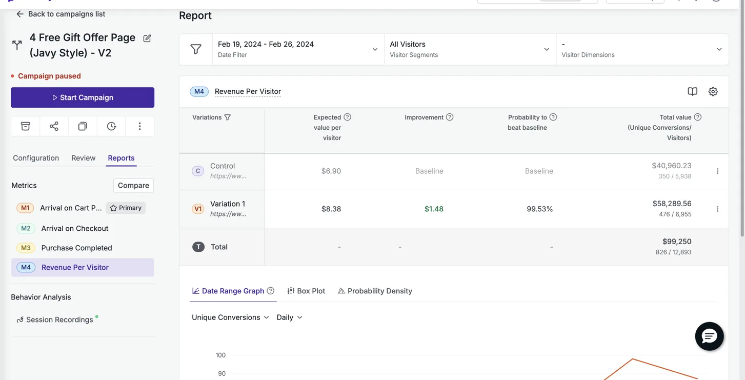
When we rebuilt Particle for Men’s page as a dedicated offer rather than a standard product page, revenue per visitor rose 21.4% against their existing page, at 99.5% confidence across 12,893 visitors on VWO. That page is still live two years later, which matters more than the headline number, because a lift that only holds for a week is a different claim than one that holds for two years.
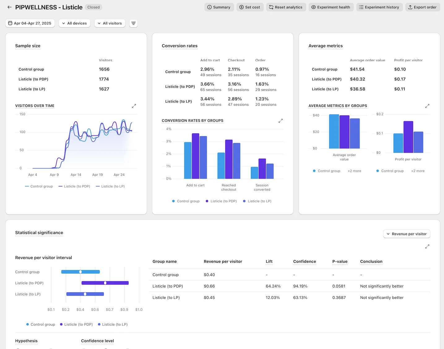
PIP Wellness, an intimate wellness brand, is the clearest case of ordering proof rather than just adding more of it. We moved from their standalone product page to a listicle format that let each proof point build on the last instead of dumping all of it above one buy button. Revenue per visitor went from $0.40 to $0.66, a 64% lift, on Meta traffic read through ABConvert.
Neither result came from a new badge or a bigger review widget. Both came from deciding what the visitor needed to believe first, and building the page to deliver it in that order.
The mistake we see on almost every audit
The most common failure is not missing proof, it is proof with no hierarchy. A row of five identical icons, a review count parked under the price with no context, a certification logo the same size as a shipping icon. Every element reads as equally important, which means none of them do. The visitor’s eye has nowhere to land first, so it lands nowhere and keeps scrolling past all of it.
The fix is not more proof, it is fewer, ranked, and placed on purpose. Catalog what the brand genuinely has, rank it against the list above, and cut anything that does not clear the bar rather than burying it lower on the page. You can see all 15 measured rebuilds this thinking has produced on our results page, each one tested against the brand’s own live traffic rather than reported by an ad platform.
Where the guarantee comes in
Reordering proof is a judgment call until it is tested, which is why every rebuild we ship runs as a real split test on the brand’s own traffic before anyone calls it a win. The offer behind this is a flat fee rebuild with a 10% lift in revenue per visitor guaranteed in a controlled test, or your money back across up to five iterations. Full terms are on /guarantee.
A page that reads well is not the same as a page that converts better. The only way to know which proof element earned its place is to test the reorder, on the traffic the brand already has, and read the number the platform reports rather than the one that feels right.
See it on your own page.
We rebuild your highest-leverage page and prove the lift on your own live traffic. A 10% lift in conversion rate, or your money back.
Book a call