
How to Reduce Product Page Bounce Rate on Cold Traffic
If you are sending cold Meta or Google traffic at a Shopify product page and most of it leaves without adding anything to cart, the page is rarely the first problem. The first problem is what the visitor landed on, and the second is what kind of page it is. Both are fixable, and both move revenue per visitor more than a button color test ever will. Here is how to actually reduce product page bounce rate on cold traffic, not just guess at it.
The real cause of a high product page bounce rate
A visitor who clicks a cold ad has one thing in their head: the product in the ad. If that click lands on a home page, a broad collection, or even a standard PDP built for a browsing visitor rather than an arriving one, the visitor has to do work to find what they came for. Most will not do that work. They bounce, and it looks like a design problem when it is really a landing mismatch problem.
This is the single biggest lever in the whole page, and it is decided before anyone writes a headline or picks a font. Get the landing right and the rest of the work has something to build on. Get it wrong and no amount of copy editing fixes it.
Match the page to the ad before you touch design
The next lever down is not how the page looks. It is what kind of page it is. A product page describes a product. An offer page argues for buying it now. Those are different jobs, and on cold traffic they convert differently, because a cold visitor has no relationship with the brand yet and needs to be told why today is the day.
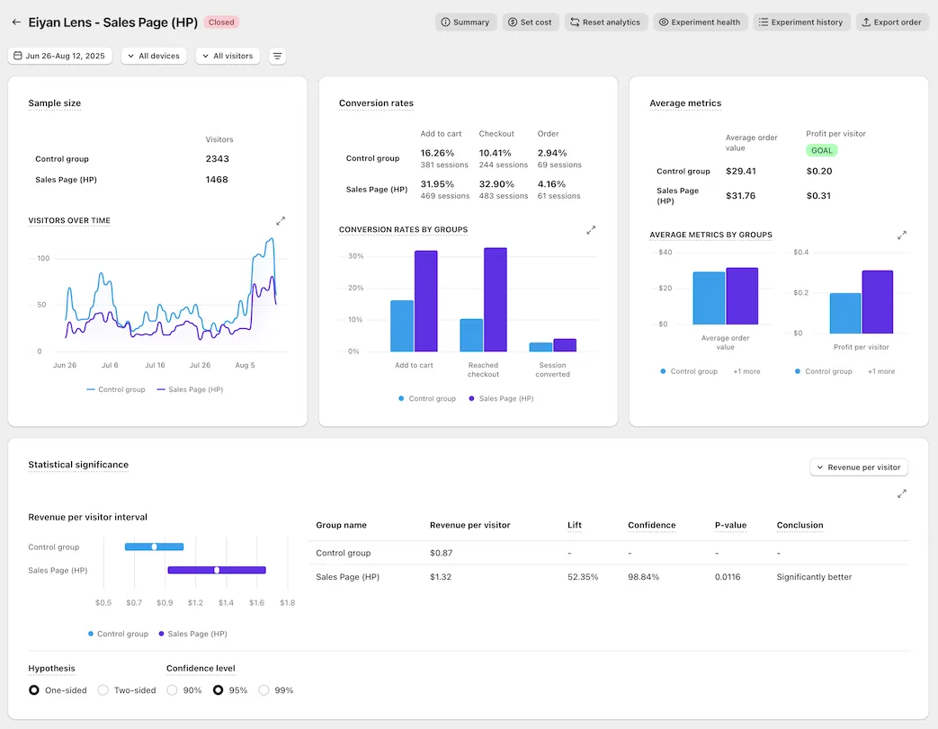
We tested this directly with Eiyan Lens, an eyewear brand running Google Ads traffic. Their offer page against their own home page produced a +52% lift in revenue per visitor, measured on their own traffic through ABConvert.
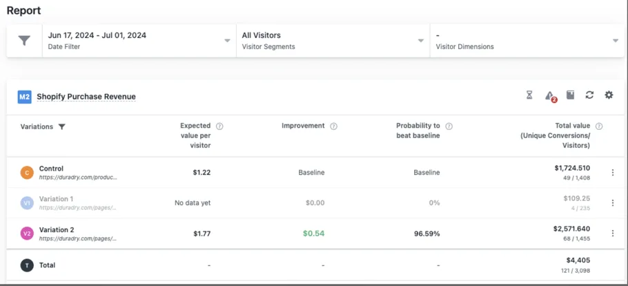
DuraDry, a sweat care brand also running Google Ads, ran the same kind of test against their existing PDP rather than a home page, over two weeks in VWO, and the offer page won by +45%. Same mechanism, different comparison, same direction.
The page type decides more than the page design. An offer page argues for buying now. A product page just describes the product.
Build the offer so leaving costs something
Once the landing and the page type are right, the next thing that actually reduces bounce and add to cart drop off is the offer itself. Most Shopify PDPs show one price and one buy button and call that an offer. It is not one. A real offer stack does several things at once:
- Tiered choice with a decoy. Three options, the best value tier badged, a popular middle tier, and a plain one time purchase shown small. The plain option exists to make the other two look smart, not to be picked.
- Unit economics beside every price. A price per serving or per day next to the total makes a big number small.
- A genuine struck through anchor price. The discount has to be the story, and the reference price has to be real.
- Value stacked, not just discounted. Itemize what comes free, price it, and total it against the discount.
- The trust cluster repeated under every buy button. Guarantee, shipping, cancel anytime, in three words each.
None of this is a redesign. It is a rebuild of the argument the page is making, and it is the part most brands skip straight past on their way to a font change.
Stack proof in the order it actually earns trust
A cold visitor has no reason to believe you yet, so proof has to do real work, and it has to be placed in the order it earns trust rather than however it happened to land in the page template. The strongest proof a brand actually has goes above the fold. Rating and volume proof sit right beside the product title. Anything deeper, like founder credibility or third party testing, earns the middle of the page. A page with thin proof should be shorter, not padded with generic reassurance.
Free the Roots ran their offer page against a collection page on Meta traffic and won by +33% in ABConvert, largely on the strength of proof placed where a Meta scroller actually reads it, not buried below three paragraphs of brand story.
What we actually test, and how we know
Every number in this post is our page against the brand’s own current page, split on their own live traffic, read straight from the A/B testing platform, never from ad platform reported revenue. We optimize for revenue per visitor specifically because it contains conversion rate and average order value at once, so a discount cannot make a losing page look like a winner.
We have worked with 400+ ecommerce brands over the years. A smaller set of those have full results we can show head to head, and you can see them at /results/. If you want the same rebuild and the same test run on your own traffic, the offer and the guarantee behind it are laid out at /guarantee/.
See it on your own page.
We rebuild your highest-leverage page and prove the lift on your own live traffic. A 10% lift in conversion rate, or your money back.
Book a call