
How to Increase Revenue Per Visitor on Shopify
If you are searching for how to increase revenue per visitor on Shopify, you have probably already tried the obvious stuff: sharper product photos, a faster theme, an urgency badge above the buy button. None of that is wrong. It is just small. The lever that actually moves revenue per visitor sits one level up, in what a visitor lands on and what that page is arguing for, not in the color of a button.
What revenue per visitor actually measures
Revenue per visitor is total revenue divided by total visitors. That single number contains conversion rate and average order value at the same time, which is why it is worth optimizing instead of conversion rate alone. Conversion rate on its own can be pushed up by discounting, or by promoting a cheaper product, and the page will look like a winner while the business earns less per order. Revenue per visitor cannot be gamed that way. A page that lifts conversion rate and drops revenue per visitor has not won anything.
Every number in this post is read the same way: the new page against the brand’s current page, split on their own live traffic, read straight from the A/B testing platform. Never revenue reported by an ad platform, which attributes generously and cannot see what a page actually did.
The biggest lever is not the page design
Before anyone touches copy or layout, three things have already decided most of the outcome.
- What the visitor lands on. An ad promoting one product that lands on a home page or a broad collection makes the visitor hunt for what they came for. Most will not bother.
- What kind of page it is. A product page describes a product. An offer page argues for buying it right now. Those are different jobs, and they convert at different rates.
- How the page is actually built. Real, and where most brands start, but a smaller lever than the two above it.
Single element tests, button color, badge wording, are close to noise at this scale. We still run them. We just do not lead with them.
The offer architecture most pages skip
This is the part that moves revenue per visitor the most on a consumable or subscription product, and it is also the part most Shopify product pages never build.
Three pricing tiers, shown in this order: the best value tier badged as such, a middle tier badged most popular, and a one time purchase shown small and unbadged. The one time option is not there to be chosen. It exists so the other two look obviously smarter next to it.
A few other pieces we build into almost every offer:
- Price per serving or per day shown beside every tier. Large numbers shrink once you divide them.
- A genuine struck through reference price. The discount is the story, but the reference price has to be real, never invented.
- A stacked value list under the price, each free item priced individually and totaled against the cost, rather than only a deeper discount.
- The trust cluster, guarantee, shipping, cancel anytime, repeated under every buy button, not just once at the top.
The size of the win is mostly decided before anyone writes a headline. Landing page choice and offer structure outweigh copy polish almost every time.
What this looks like in the results
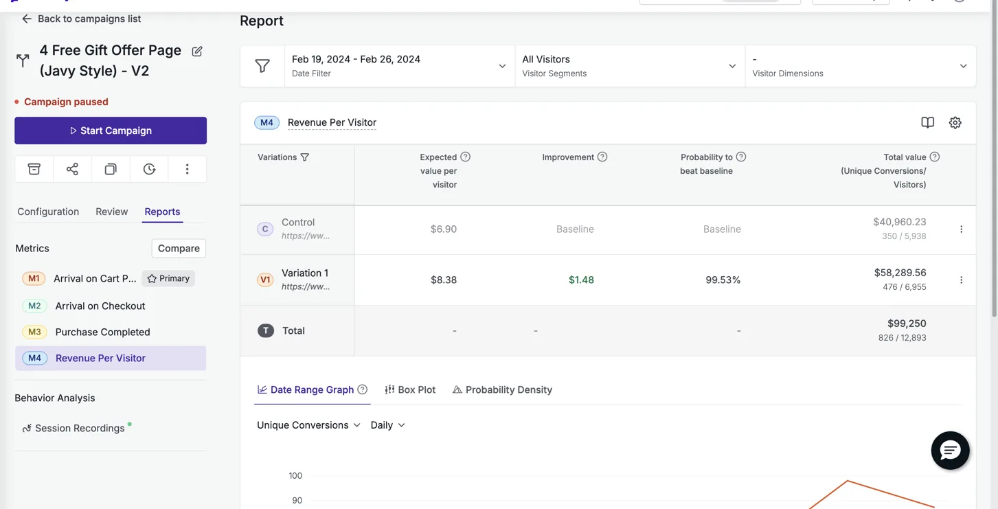
Particle for Men ran their offer page against their own product page in VWO, on Google Ads traffic, across 12,893 visitors, and it won by 21.4% on revenue per visitor at 99.5% confidence. That page is still live two years later.
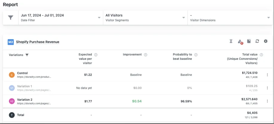
DuraDry, a sweat care brand, ran the same shape of test, offer page against their product page, on Google Ads traffic in VWO, over two weeks, and came out 45% ahead on revenue per visitor.
Different categories, different testing platforms, same underlying move: replace the product description with an argument for buying now. That pattern holds across the full set of measured tests on the results page, fifteen in total, spanning skincare, eyewear, oral care, functional food, and more.
Testing it without fooling yourself
A big lift on a small sample is a direction, not a result. Two of our measured tests, Prime Natural and Snuff Cup, cleared 300% on small samples, and we describe them as directional for exactly that reason. Read the confidence level, not just the arrow.
The other trap is timing. A page that wins its controlled test and then runs at full traffic for a long stretch will usually read lower later than it did during the test. That is decay, not a lie about the original number, which is why we always publish the controlled result with its methodology attached rather than a live snapshot months on.
If you would rather have someone build the offer page than build it yourself, that is the entire job: a flat $2,500 page rebuild with a 10% revenue per visitor lift guaranteed in a controlled test, or your money back, detailed on the guarantee page.
See it on your own page.
We rebuild your highest-leverage page and prove the lift on your own live traffic. A 10% lift in conversion rate, or your money back.
Book a call