
A Price Per Day Pricing Strategy for Shopify Offer Tables
A $64 subscription price looks expensive until you divide it by thirty. Then it is $2.13 a day, which is a different number to argue with, and it is one of the cheapest changes you can make to a Shopify offer table this month.
Most subscription and consumable brands show one number: the price of the box. That number carries the full weight of the decision in the shopper’s head, and a full month or a full bottle is always going to look large next to a coffee. The fix is not a discount. It is a price per day pricing strategy that breaks the same total into the unit the shopper actually experiences, serving by serving or day by day, and prints it right beside the price they are already looking at.
Why a price per day pricing strategy works on Shopify
The mechanism is simple and it is not persuasion in the manipulative sense, it is accuracy. A thirty day supply at $64 and a daily cost of $2.13 are the exact same offer. The shopper is not being tricked into a smaller number, they are being shown the number that actually matches how they will use the product. A bottle is a purchase decision. A cup of coffee’s worth of cost per day is a habit decision, and habits are easier to say yes to than purchases.
This only works when the unit is real. Supplements, gummies, skincare used daily, anything consumed on a schedule all have a true price per serving. A one time hardware purchase does not, and dividing it by days owned is the kind of invented math a shopper catches immediately and holds against the whole page. Use the framing where the unit is genuine, skip it everywhere else.
Build it beside a real anchor, never instead of one
The price per day number and the struck through anchor price are doing two different jobs, and the biggest mistake brands make is picking one over the other. The anchor says this is worth more than you are paying. The per day price says what you are paying barely registers. A page with only the anchor still leaves the raw total sitting there to be judged. A page with only the per day price has nothing to compare it against, no discount story, no reason the deal is good right now rather than always available.
Run both. The anchor has to be a price the brand actually charged, never an invented inflation, because a shopper who senses a fake markdown will not trust anything else on the page either. The per day figure sits underneath or beside it, smaller type, same line, doing quiet work while the anchor does the loud work.
Where it goes in the offer table
In a tiered offer table, the unit price belongs in exactly one place: directly under the headline price of every tier, not just the one you want chosen. If only the best value tier shows a per serving number, the comparison is rigged and shoppers notice the asymmetry even if they cannot name it. Show it consistently and let the tiers win or lose on their own math.
- Headline price and the struck through anchor on the same line
- Price per serving or per day directly beneath, in a lighter weight
- The one time purchase option shown small and unbadged, so the subscription tiers read as the obviously smarter choice
This is the same offer architecture that sits under every rebuild we publish results for: tiered choice, a real anchor, unit economics on every tier, trust signals repeated under the buy button. None of those pieces does much alone. Stacked, they change what the shopper is actually comparing.
What this looks like when it is tested
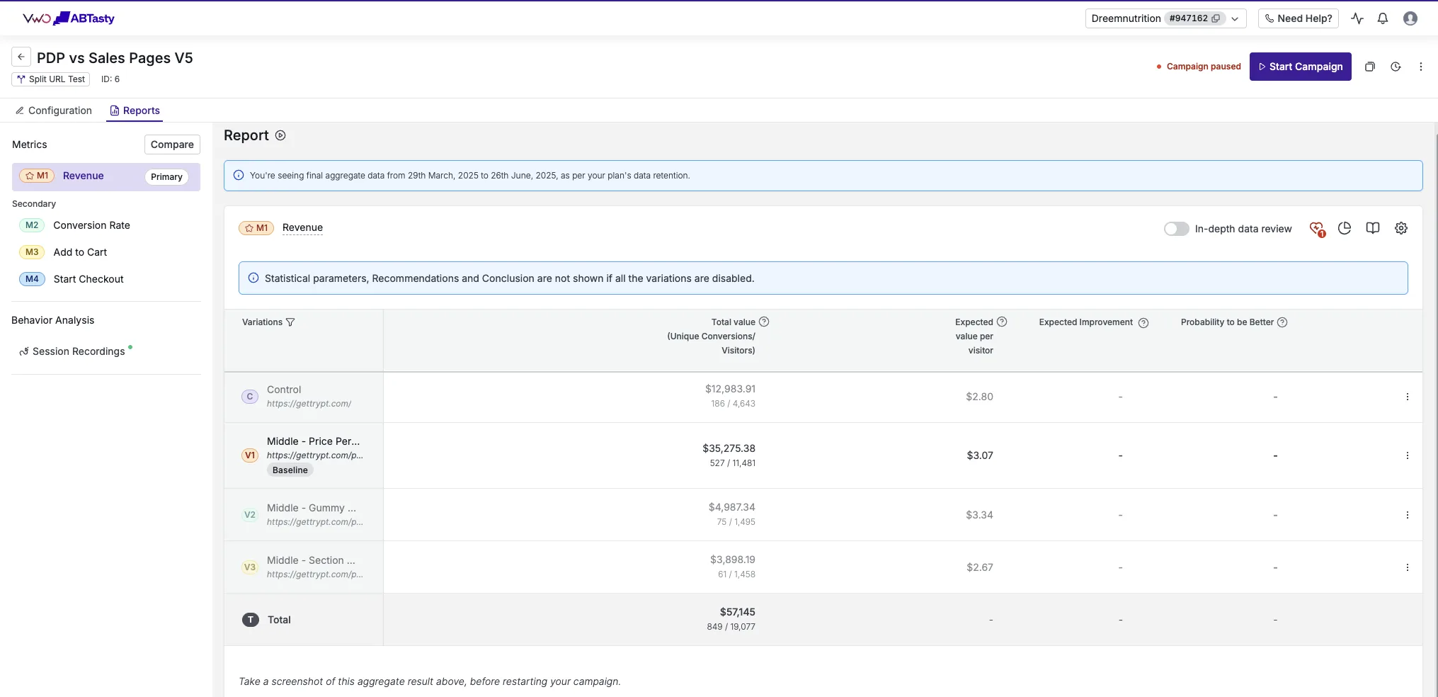
Dreem Nutrition sells gummies, a product with a genuine daily serving, and their offer page built around this kind of framing beat their existing product page by +19% revenue per visitor, tested on VWO against Meta traffic with full metric tracking. That is the test we would expect a true per day number to win. It does not relabel the price, it just makes the actual math visible.
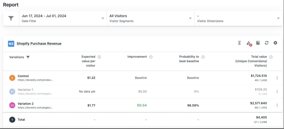
DuraDry is the other side of the same coin, an anchor price done right. Their offer page ran a real struck through price against their product page on Google Ads traffic through VWO for two weeks and came back +45% revenue per visitor. The anchor was not an invented number, and the lift held across the full test window rather than spiking and fading.
A real anchor plus a real per day number is not two persuasion tricks, it is the same price told twice, once as a decision and once as a habit.
Read it in revenue per visitor, not just conversion rate
A smaller looking number can lift conversion rate on its own, which is exactly why it has to be checked. If the per day framing pulls shoppers toward the cheapest tier, conversion rate can rise while average order value falls, and the store earns less per visitor even as the chart looks better. Revenue per visitor holds both numbers at once, which is why every case we publish is read that way, from the A/B testing platform, never from ad platform reported revenue. If the unit price framing is only moving people to the smallest option, it is not a win, it is a shift. Read both before you call it one.
If you want to see what a tested offer table with this kind of framing looks like in full, the results page has the dashboards, and the guarantee covers how we test a rebuild like this against your own current page before you pay for it.
See it on your own page.
We rebuild your highest-leverage page and prove the lift on your own live traffic. A 10% lift in conversion rate, or your money back.
Book a call