
Why Every AI Generated Landing Page Looks Generic
Open ten AI generated product pages side by side and you will see the same page ten times. Three equal columns under the fold. A bordered card around every feature, every stat, every testimonial. No single moment where the eye is told to stop. That is why an ai generated landing page looks generic before anyone reads a word of the copy. The structure is the tell, not the writing.
Why an ai generated landing page looks generic before you even read it
Model a page from a prompt and you get a page that hedges. Nothing is more important than anything else, so everything gets the same treatment: a rounded rectangle, a hairline border, a little padding, repeat. Three of those side by side becomes a three column grid. Six becomes two rows of three. It is not a bad idea once. It is a bad idea as the entire vocabulary of the page.
The result reads as templated because it is templated. Equal visual weight everywhere means no focal point anywhere, and a human editor would never do that to their own product. They would make the founder photo bigger than the shipping icon. A generated page cannot tell the difference on its own.
The kind of page matters more than how polished it looks
Before any layout question, there is a bigger one: what job is this page doing. A product page describes a product. An offer page argues for buying it now. Those are different documents, and most brands only ever built the first one.
When we rebuilt Legendary Car Care’s automotive page as an offer page instead of a standard product page, on Meta traffic, measured with ABConvert against their existing PDP, revenue per visitor rose 32%. Nothing about the fonts or the colors changed the outcome. The page changed jobs.
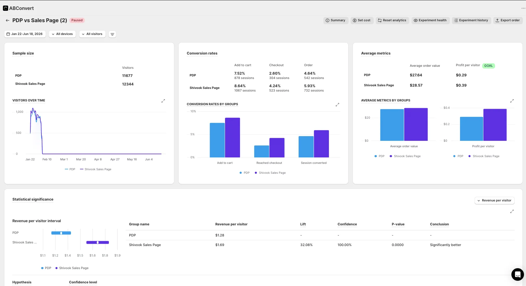
This is the first thing to check before touching a single card component. If the page is doing the wrong job, no amount of layout polish fixes it.
Break the three column grid
Once the page is doing the right job, the structural fixes are specific and repeatable.
- Reserve the bordered card for things a visitor actually selects, like a pricing tier. Everywhere else, let type size, whitespace, and a hairline rule do the separating. A page that is a stack of identical boxed tiles reads as a template no matter what is written inside them.
- Break the equal column grid. Three matching columns means three things of equal importance, which is almost never true. One wide block and one narrow block beside it forces a hierarchy the reader can feel.
- Vary the rhythm. Alternate a dense, detailed block with an airy, single line statement. A page that never changes density has no pulse.
- Spend one bold moment, not five medium ones. Pick a single place on the page, usually the anchor price or the guarantee, and make it visually louder than everything around it. A page that alternates light and dark banding the whole way down spends its loudness on nothing.
We proved the structure lever on its own with Bareline, a streetwear denim brand. Same page type on both sides, our PDP template against their PDP template, tested sitewide on real product traffic through Eraya. Revenue per visitor rose 13.5% at 99% probability to win across 92,484 sessions. No offer change, no new page type. Just structure.
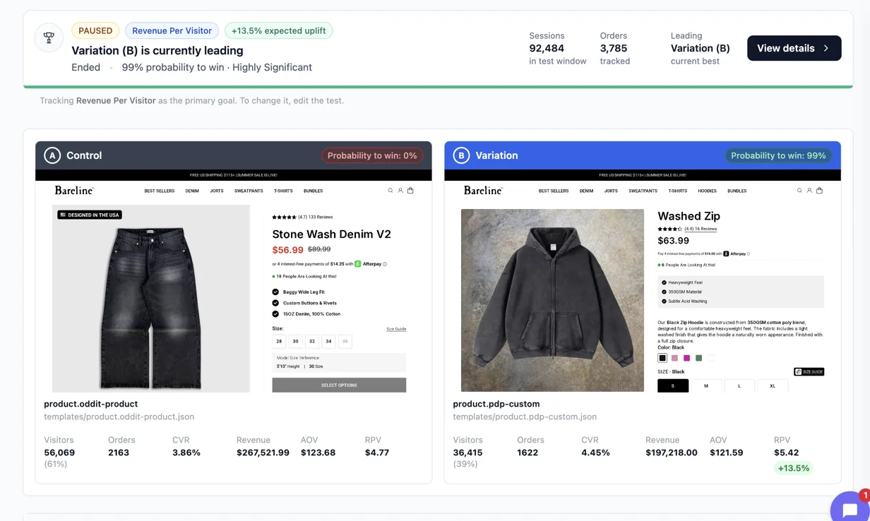
A page that is a stack of identical bordered tiles is not a design choice. It is the absence of one.
Proof needs an order, not a decoration row
The other generic tell is a row of icon plus paragraph trust badges, evenly spaced, all the same size. Real proof has a hierarchy too. Whatever the brand’s single strongest piece of evidence is, whether that is a founder story, a real certification, or a genuine review volume, it belongs above the fold or in the first scroll, not buried in a row with four weaker claims competing for the same attention. Deeper proof earns the middle of the page. If the proof is thin, the fix is a shorter page, never a padded one.
The structural devices should come from the product itself where possible, not a generic numbered icon set that could belong to any brand in any category. A numbered sequence is only earned when the content is genuinely a sequence.
What a controlled test actually tells you
None of this is guessing. Every number above came from a controlled test on the brand’s own live traffic, read from the testing platform itself, never from ad platform reported revenue. That distinction matters because a page can win on conversion rate while losing on revenue per visitor, and only a real split test on real traffic catches that.
It is also worth saying plainly that a winner tested at a small sample is a direction, not a verdict, until it runs long enough to be significant. You can see the full run of measured results, including the small sample ones we label as such, on our results page. And if you want to see how we sequence all of this on a real rebuild, from offer to proof to layout, the methodology breaks down the order we build in and why it is a bigger lever than any single component on the page.
See it on your own page.
We rebuild your highest-leverage page and prove the lift on your own live traffic. A 10% lift in conversion rate, or your money back.
Book a call