
The Best Landing Page for Facebook Ads on Shopify
Run a Facebook or Google ad that promises one product, then send the click to your homepage, and you have already lost most of the sale before the page even loads. The best landing page for Facebook ads on Shopify is never the homepage, and it is rarely a collection page either. It is a page built around the exact product the ad promised, argued as an offer rather than described as a listing.
The click already made a promise
An ad is a promise. It shows one product, one price, one reason to click. A homepage or a broad collection page breaks that promise the moment it loads, because it hands the visitor a new decision instead of the answer they already clicked for. Most visitors will not do the extra work of finding the product themselves. They bounce, and the ad spend that got them there is gone.
This is the first and biggest lever in how we rebuild a page, ahead of layout, ahead of copy, ahead of any single element test. Where the visitor lands decides more of the outcome than how the page underneath is built. Get that wrong and no amount of polish recovers it.
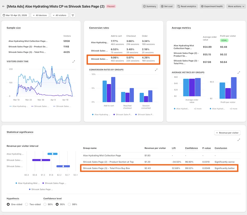
We measured this directly with Free the Roots, a natural hair care brand. Their offer page tested against their existing collection page, on real Meta traffic, read through ABConvert. The offer page won by 33% more revenue per visitor.
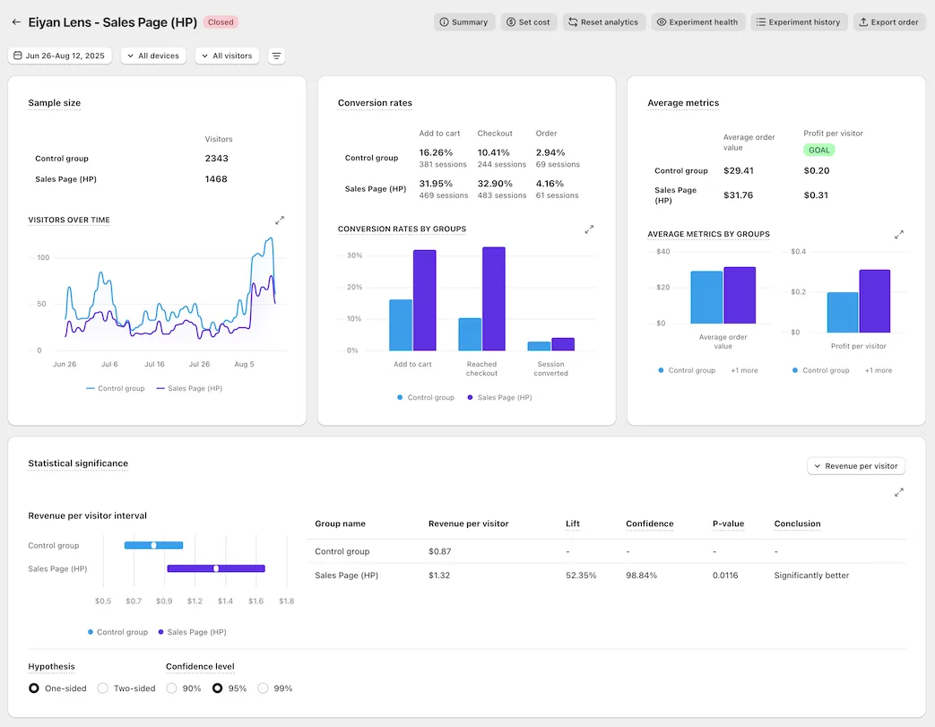
Eiyan Lens ran the same test one level up: offer page against home page, on Google Ads traffic. The offer page won by 52%.
What the best landing page for Facebook ads on Shopify actually is
It is not a product page with better photos. A product page describes a product. An offer page argues for buying it now, and those are different jobs that convert at different rates.
The offer page carries three things a product listing usually does not:
- A reason to buy today, not eventually
- The strongest proof the brand has, placed in the first scroll instead of buried
- One clear decision instead of a menu of options
Legendary Car Care tested an offer page against their own product page on Meta traffic and saw revenue per visitor rise 32%. Sonic Brush ran the same shape of test on Google Ads traffic and moved 24%. DuraDry moved 45% over two weeks. None of these are the site getting prettier. They are the same product, argued differently, to the same visitor.
The part most pages get wrong
Once the visitor lands on the right page, the next lever is the offer itself, not the layout. Most Shopify pages present one price and one button. The pages that outperform present a choice with a decoy built in: three tiers, the best value option badged, a middle option badged as most popular, and a plain one time purchase shown small and unbadged, there mainly to make the other two look like the obvious pick. Price per unit or per serving sits beside every tier, because a large number shrinks the moment it is divided.
The homepage answers what do you sell. The ad already answered that. The page has one job left: argue for this product, right now.
Dreem Nutrition tested an offer page against their product page with full metric tracking on VWO and gained 25% in revenue per visitor. Particle for Men ran an offer page against their own product page and it is still live two years later, at 21.4%, checked at 99.5% confidence across 12,893 visitors. That is not a launch week spike. That is a page that keeps winning after the novelty wears off.
Read the result the right way
None of this is worth acting on unless it is read correctly. Every number above is the new page against the brand’s own current page, split on their own live traffic, read from the A/B testing platform, never a number reported by the ad platform itself. Ad platforms attribute generously and cannot see what a page actually did to revenue per visitor, a metric that moves conversion rate and average order value together and cannot be gamed by a discount alone.
Two of the results in this line of work, Prime Natural and Snuff Cup, moved over 300% each. We say plainly that both ran on a small sample. A big number on a small sample is a direction worth testing further, not a settled result, and that distinction matters more than the number itself.
If you want the full set of measured results, they are on our results page. If you want the mechanics behind the guarantee that backs this offer, that is on the guarantee page.
See it on your own page.
We rebuild your highest-leverage page and prove the lift on your own live traffic. A 10% lift in conversion rate, or your money back.
Book a call