
Shopify Product Page Conversion Rate Optimization That Works
Shopify product page conversion rate optimization has a reputation for being about button colors and badge wording. It isn't. The lift is decided upstream, before anyone touches a headline, and the fifteen controlled tests we can actually point to prove it out.
We have worked with 400+ ecommerce brands. That number describes relationships, not tests. The tests are a separate, much smaller number: fifteen measured results, each one the new page against the brand’s own current page, split on their own live traffic, read from an A/B testing platform. Never ad platform reported revenue, which attributes generously and cannot see what a page actually did. Everything below traces back to one of those fifteen.
Shopify product page conversion rate optimization starts with where the visitor lands
Most of the outcome is decided before a single word gets written. In order of how much each one actually moves revenue per visitor:
- Where the click lands. An ad for one product landing on a home page or a broad collection makes the visitor hunt for what they came for. Most will not bother.
- What kind of page it is. A product page describes a product. An offer page argues for buying it now. Different jobs, different conversion rates.
- How the page is built. Real, and where most brands start, but a smaller lever than the two above.
- Single element changes. Button color, badge copy. At this scale, mostly noise.
Free the Roots tested an offer page against a collection page on Meta traffic and saw revenue per visitor go up 33%. That gap opened almost entirely on the landing decision, before the offer copy did any work at all.
The offer page beats the product page on its own
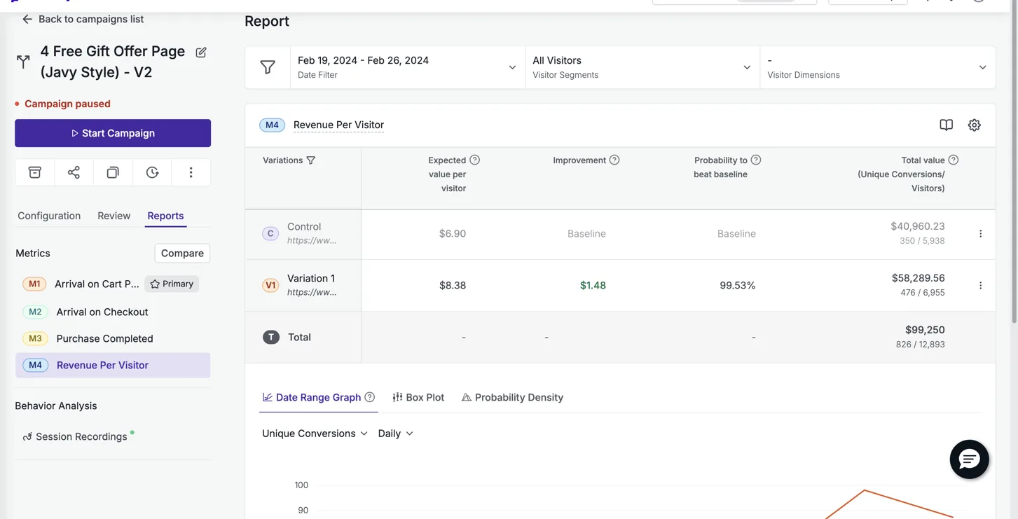
A product page’s job is to describe. An offer page’s job is to make the case for buying right now, and that difference alone accounts for some of the largest numbers we have. Particle for Men ran their offer page against their own product page on VWO, 99.5% confidence across 12,893 visitors, and revenue per visitor rose 21.4%. That page is still live two years later.
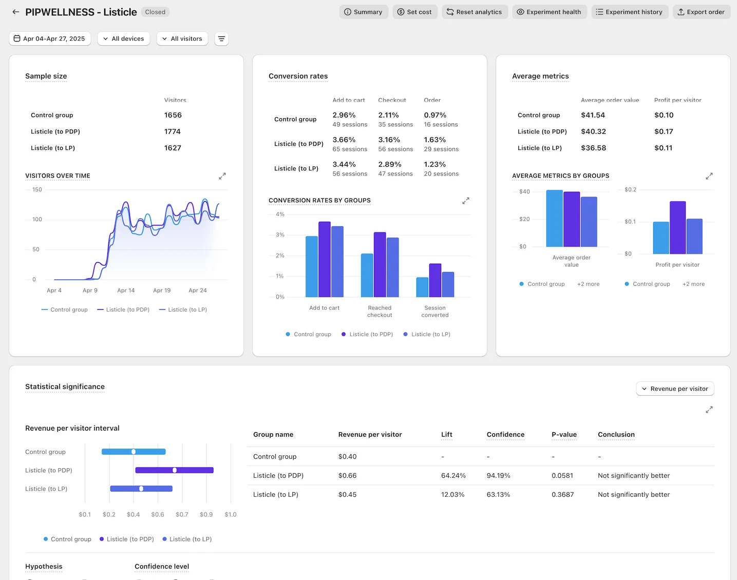
PIP Wellness ran a listicle style page against their product page on Meta traffic through ABConvert and moved revenue per visitor from $0.40 to $0.66, a 64% lift. That is not a smaller version of the same story. It is the same mechanism doing the same work on a completely different category.
What the offer stack has to actually contain
Once the page type is right, the thing most rebuilds get wrong is the offer itself. A few pieces do most of the work:
- Tiered choice with a decoy. Three options, best value badged, middle option badged most popular, one time purchase shown small and unbadged so the other two look like the obvious pick.
- Unit economics beside every price. Price per serving or per day. Large numbers get smaller when you divide them.
- A genuine struck through anchor price. The discount is the story, and it only works if the reference price is real.
- Value stacked, not just discounted. Itemize what comes free, price each piece, total it against the discount.
- The trust cluster repeated under every buy button. Guarantee, shipping, cancel anytime, three words each.
Gum of Gods tested our offer page against their own offer page, same traffic source, same platform, and still saw revenue per visitor climb 97%. The gap between two offer pages built by two different people is often as large as the gap between an offer page and a product page. Structure is not optional once you commit to the format.
The offer architecture is where a rebuild either earns its lift or leaves it on the table, and it has nothing to do with the hero image.
Proof has an order, and most pages ignore it
Catalog what the brand genuinely has before writing a word of copy. Roughly strongest to weakest: a founder or credible association, a real ambassador roster, a scientific or medical advisory board, a real clinical result with a registry link, third party testing and certifications, volume and rating proof, verified reviews and video testimonials.
The strongest thing a brand has goes above the fold. Rating and volume proof sit beside the title. Deeper proof earns the middle of the page, and a page with thin proof should run shorter rather than get padded with filler sections to look complete. Eiyan Lens moved revenue per visitor 52% testing an offer page against a home page on Google Ads traffic, largely because the offer page put real proof where the home page buried it three clicks deep.
Never invent a certification, a trial, or a review count that is not real. A borrowed number is the first thing a founder catches, and it costs the whole page its credibility.
Read significance, not the headline number
Prime Natural moved revenue per visitor 307% on a small sample. That is a real result and a genuine direction, not yet a settled one, and the honest way to describe a small sample win is exactly that: promising, not proven. Bareline ran at 92,484 sessions with a 99% probability to win and landed at 13.5%, a smaller number carried by a much larger sample. Both are true. They are not the same kind of claim.
A winner that runs at full traffic for months will usually read lower later than it did in its controlled test. That is decay, not a lie about the original number, which is why we publish the controlled result with its methodology attached rather than a live dashboard snapshot. You can see the full set, brand by brand, on /results. If you want to know what a rebuild costs and what happens if it does not hit the number, that is on /guarantee.
See it on your own page.
We rebuild your highest-leverage page and prove the lift on your own live traffic. A 10% lift in conversion rate, or your money back.
Book a call