
Shopify Pricing Table Design to Increase AOV
Most Shopify pricing tables are three boxes with the same border, the same button, and a discount buried in the smallest one. That is not shopify pricing table design increase aov, that is three products lined up hoping the visitor does the math themselves. The visitor will not do the math. The table has to do it for them, and the table has to be built so the middle option is the only one that feels rational to click.
We build offer pages for a living, one at a time, at one flat fee per page, and the pricing table is usually the single highest leverage block on a consumable or subscription product. Get it wrong and you have a menu. Get it right and it is an argument.
Shopify pricing table design to increase AOV starts with a decoy
The structure is three tiers, in this visual order: the best value tier badged as such, the middle tier badged most popular, and a one time purchase option shown small and unbadged, usually last.
That third tier is not there to be bought. It is there to make the other two look smart by comparison. A visitor scanning left to right sees the full price standing alone, then sees a subscription or multi pack sitting right beside it for barely more money and a much better per unit price. The one time option does the anchoring work for free. You never have to say “this is the worse deal.” The table says it.
This only works if the decoy is a real, purchasable option and not a strawman. Inflate it and a visitor who has seen a hundred pricing tables will feel the trick and trust the rest of the page less.
Anchor with a price that is actually real
A struck through price only works as an anchor if it is true. If the reference price is invented, the discount is a lie the moment the visitor checks the product elsewhere, and it costs you the whole page, not just that line.
The anchor rule that actually holds up:
- The struck through number is a genuine prior price or a genuine full retail price, never fabricated inflation
- Every tier shows price per unit, per serving, or per day next to the total, because large numbers shrink when divided
- The discount percentage is stated once, plainly, not repeated in five different badges fighting for the same attention
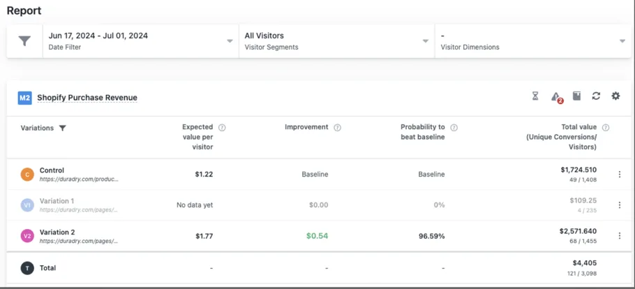
We ran this exact logic on DuraDry, a sweat care brand, testing an offer page against their existing product page on Google Ads traffic over two weeks in VWO. The offer page, built with a real tiered structure and honest unit pricing, lifted revenue per visitor 45%.
Stack value instead of stacking discounts
A deeper discount is the first lever most brands reach for, and it is usually the wrong one, because a discount lowers the number you actually collect. Value stacking does not.
Itemize what comes with the middle tier. Price each item individually, even the ones you would normally throw in free. Total it against what the visitor actually pays. A free item that is worth more than the discount you were about to offer beats the discount every time, because the visitor’s attention lands on the total value, not on the fact that you gave something away.
A page that stacks value instead of cutting price is arguing that the middle tier is worth more, not that it costs less. Those are different arguments and only one of them protects your margin.
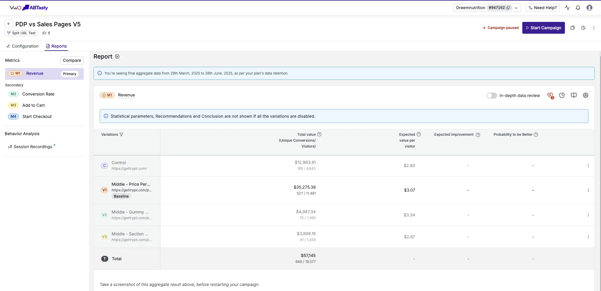
We saw the same underlying mechanic, an offer page built around a real value case rather than a discount, on Dreem Nutrition, a wellness gummy brand. Their offer page beat their existing product page by 25% revenue per visitor, tested in VWO with full metric tracking.
Repeat the trust cluster under every buy button
The guarantee, the shipping terms, and the cancel anytime line should not live once at the bottom of the page. They belong directly under each buy button, on every tier, as three short words with an icon each. A visitor deciding between two tiers is deciding in that exact moment, not scrolling down to find reassurance afterward.
This is a small detail and it is also the difference between a table that reads as confident and one that reads as hopeful.
Test the table before you test anything else
Of everything on a rebuilt page, the offer table is the highest leverage thing to test, ahead of headline copy and ahead of image order. Build it so the tiers, the badge, and the anchor price can be swapped without touching the rest of the page, then read the result against the current page on your own live traffic. Read significance, not just direction. A big lift on a small sample is a direction, not a result yet.
We guarantee a 10% lift in revenue per visitor in a controlled test on your own traffic, or your money back, across up to five iterations. If AOV specifically is what you are trying to move, that is exactly the mechanic behind our AOV jumpstart offer, and the full case list, tiered pricing and otherwise, is on our results page.
See it on your own page.
We rebuild your highest-leverage page and prove the lift on your own live traffic. A 10% lift in conversion rate, or your money back.
Book a call