
Low Conversion Rate Shopify Product Page? Fix This First
A low conversion rate on a Shopify product page gets blamed on the page itself almost every time. The copy is weak, the photos are flat, the button is the wrong green. Sometimes that is true. More often the page was never going to convert well no matter what it said, because the real problem sits one or two levels above the page, and no amount of copywriting fixes a problem that lives somewhere else.
What a low conversion rate on a Shopify product page is actually telling you
Conversion rate is a single number that can be dragged down by at least four different failures, and they do not carry equal weight. Most stores start fixing them in reverse order: button color first, page structure second, page type third, traffic destination last, if at all. That is backwards. The honest order, biggest lever first, looks like this.
- Where the visitor lands. Sending ad traffic to a home page or a broad collection instead of the specific product.
- What kind of page they land on. A product page describes. An offer page argues for buying now.
- How the page is built. Structure, proof, offer architecture.
- Single elements. Button color, badge wording, a headline tweak.
Most of the energy a store spends on conversion rate goes into the bottom of that list. Most of the result sits at the top.
Fix the destination before you fix the page
If a Meta or Google ad promises one product and the click lands on a home page, the visitor has to do the work of finding what they were promised. Most will not bother. This sounds obvious written down, and it is still one of the most common things we find when we look at a struggling page.
When Eiyan Lens moved traffic from the home page to a dedicated offer page, revenue per visitor rose 52% on Google Ads traffic, read from ABConvert. Nothing about the product changed. The page the click landed on did.
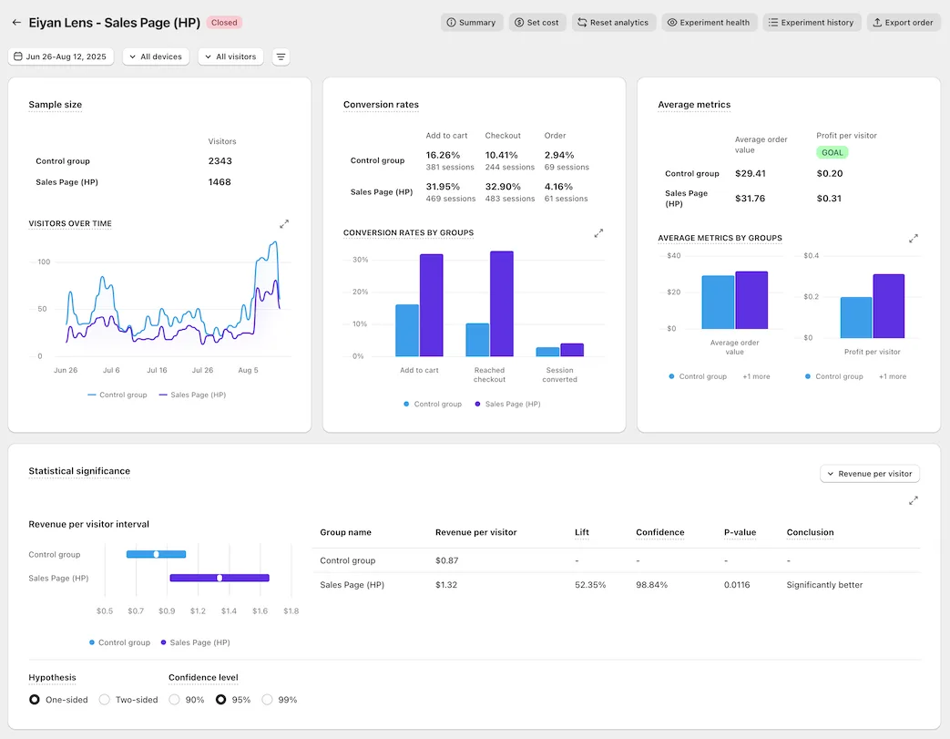
Before touching a single word on the page, check where the traffic is actually landing and whether that destination matches what was promised in the ad.
A product page and an offer page are not the same tool
This is the layer most people skip past, and it is where we spend most of our own time. A product page describes what something is. An offer page argues for why someone should buy it right now, on this visit, instead of adding it to a list and leaving. They are built differently and they convert differently, and a store with a low conversion rate on a Shopify product page is frequently running a product page where the traffic needed an offer page.
When Legendary Car Care replaced its standard product page with an offer page for the same product, on the same Meta traffic, revenue per visitor rose 32%, measured in ABConvert.
The page type decides more of the outcome than anything written on the page. Get the page type wrong and the best copy in the world is still fighting the wrong fight.
The offer architecture most pages skip
Once the page type is right, the next lever is how the offer itself is built, and this is where most Shopify product pages leave money sitting in plain sight.
- Show tiered choice, not one price. Three options, visually ranked: a best value tier badged as such, a middle tier badged most popular, and a single purchase option shown small and unbadged, there to make the other two look like the obvious smarter choice.
- Show the unit economics everywhere. Price per serving or per day beside every tier. A large number shrinks the moment it is divided.
- Anchor with a real struck through price, never an invented one.
- Stack value instead of only discounting further. Price out what is included free and total it against the discount. Free items that out value a deeper discount win more often than the deeper discount does.
Bareline rebuilt on this kind of template against its original product page, same sitewide traffic, and revenue per visitor rose 13.5% across 92,484 sessions at 99% probability to win, read in Eraya. Daily Sale saw a 63% lift the same way, at 100% probability to beat the control across 75,300 visitors.
Proof, placed correctly, beats proof added everywhere
The mistake is not usually a lack of proof. It is proof placed without a sense of priority. Whatever the brand genuinely has, the strongest piece belongs in the first scroll, ratings and volume sit beside the title, and deeper proof like certifications or trial detail earns the middle of the page. A page with thin proof should run shorter, not get padded with filler claims to look fuller. DuraDry moved revenue per visitor 45% rebuilding this way against its own product page on Google Ads traffic over a two week test, read in VWO. We cover the full proof hierarchy and how we weigh it on a rebuild on our methodology page, and the rest of the measured results sit on the results page.
Save the button color for last
A single element change can still matter, but it is a small lever compared to the three above it, and testing it first is how a store spends weeks proving almost nothing. Get the traffic landing on the right page, make that page the right kind of page, build the offer and the proof in the right order, and only then spend time on the button.
Every result cited here is the rebuilt page against the brand’s own existing page, split on their own live traffic, read from the testing platform rather than from ad reported revenue, which is also the shape of the guarantee behind our own rebuilds, detailed on the guarantee page.
See it on your own page.
We rebuild your highest-leverage page and prove the lift on your own live traffic. A 10% lift in conversion rate, or your money back.
Book a call