
The High Converting Product Page Structure, Explained
Most posts on this topic show you a stack of boxes: hero, benefits, reviews, FAQ, buy button. That is not a high converting product page structure, it is a layout. The structure that actually moves revenue per visitor gets decided before anyone opens a design tool, in three questions: what is the visitor already expecting, what kind of page are they landing on, and what is the page arguing for. Get those wrong and the cleanest layout in the world will not save it.
What a high converting product page structure actually does
The size of a win is mostly decided before a single section gets written. In rough order of leverage:
- What the visitor lands on. An ad for one product that lands on a home page or a broad collection makes the visitor do the work of finding what they came for. Most will not do it.
- What kind of page it is. A product page describes a product. An offer page argues for buying it now. These are different jobs, and they convert differently.
- How the page itself is built. Real, and the level most brands stop at, but a smaller lever than the two above.
- Single element changes. Button color, badge wording. Close to noise at this scale.
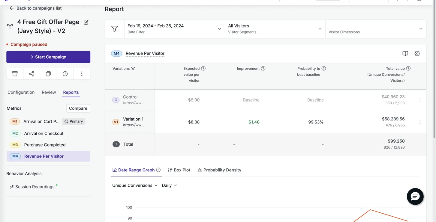
We ran an offer page against Particle for Men’s own product page, same product, same traffic. The offer page won by 21.4% revenue per visitor, at 99.5% confidence across 12,893 visitors, and it has stayed live for two years. That is not a copywriting tweak. That is a different page doing a different job.
The offer architecture most pages skip
Here is the part that gets built wrong most often, and the part that moves revenue most on a consumable or repeat purchase product. It is not a hero image problem. It is a math problem the page refuses to do for the visitor.
- Tiered choice with a decoy. Three options in visual order: the best value tier badged as such, a middle tier badged most popular, and a one time purchase shown small and unbadged. The one time option exists to make the other two look obviously smarter, not to be chosen.
- Unit economics beside every tier. Price per serving or per day next to the total. Large numbers shrink when divided.
- A genuine anchor price, struck through. The discount is the story, but the reference price has to be real. An invented inflation is the first thing a sharp visitor spots.
- Value stacked, not just discounted. Itemize what comes free, price each item, total it against the discount. Free add ons that out value the discount beat a deeper discount every time.
- The trust cluster repeated under every buy button. Guarantee, shipping, cancel anytime. Three words each, not a paragraph.
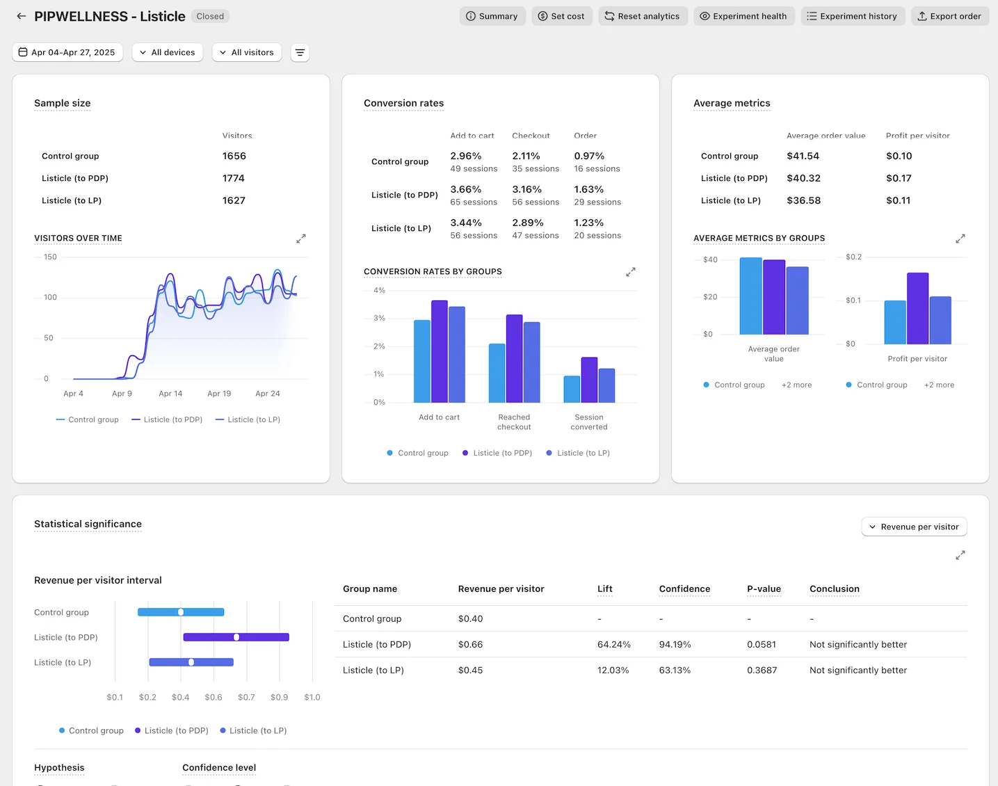
PIP Wellness never had a product page problem in the way most brands mean it. Their product page was fine. What it lacked was an argument. We tested a listicle style offer page against their control on Meta traffic, and it lifted revenue per visitor from $0.40 to $0.66, a 64% lift. Same product. Same traffic source. The only thing that changed was whether the page made a case or just described an item.
Proof, ranked and placed on purpose
Most pages either have no proof strategy or have one proof strategy: reviews, everywhere, forever. Catalogue what a brand genuinely has, then layer it in order of strength. Roughly, from strongest: a founder or credible association, an ambassador roster with real credentials, a scientific or medical advisory board where the institution carries the weight, a real clinical trial with named outcomes, third party testing and certifications, then volume and rating proof, then verified reviews and video testimonials.
The strongest proof a brand has belongs above the fold or in the first scroll. Rating and volume proof sit beside the product title, where the visitor is already looking. Deeper proof earns the middle of the page. A page with thin proof should be shorter, not padded to feel substantial.
A page that is a stack of identical bordered tiles reads as templated no matter how good the copy inside each tile is.
What makes a rebuilt page look built, not generated
This is the failure mode that shows up most in AI built or freelancer built pages, and it has nothing to do with the words.
- Reserve the bordered, filled card for things that are actually selectable, like the offer tiers. Everywhere else, let type hierarchy and whitespace do the separating.
- Break the three equal column grid. Equal weight means no focal point.
- Vary the rhythm. Alternate dense blocks with airy statement moments, the way a good page breathes.
- Spend one bold visual moment rather than banding the whole page light, dark, light.
We rebuilt Bareline’s PDP template against their own template, sitewide, on real product traffic. It won by 13.5% revenue per visitor at 99% probability to win across 92,484 sessions. That is a structural win on a page that already had decent copy. The template itself was the lever.
Reading the result honestly
A large lift on a small sample is a direction, not a result. Prime Natural’s page lifted revenue per visitor 307%, and Snuff Cup’s lifted 310%, and both are reported next to their sample size for exactly that reason: small sample, big number, real but read with care. Compare that to Free the Roots, where an offer page beat a collection page on Meta traffic by 33%, or Dreem Nutrition’s 25% against their own PDP on VWO with full metric tracking. Different confidence, different weight.
Every number we publish is the new page against the brand’s own current page, split on their own live traffic, read straight from the testing platform. Never ad platform reported revenue, which attributes generously and cannot see what a page structure actually did. You can see the full set of measured results on /results/, and how we back the number with our own money on /guarantee/.
See it on your own page.
We rebuild your highest-leverage page and prove the lift on your own live traffic. A 10% lift in conversion rate, or your money back.
Book a call